Tuesday, June 22, 2010

Imac 27 and Windows 7: the wireless keyboard and mouse finally work

I'm really enjoying using my new IMac 27. It works wonderfully with Windows 7. I also use Revit, and the screen size is perfect allowing two views of the model on the screen at the same time. The screen width is the equivalent of two 19" monitors, so the model views are a good size for working.

I've had big trouble though trying to get the wireless mouse and keyboard to work. Last night there was an update to Bootcamp for the bluetooth driver. I installed this, then tried to get the wireless keyboard and mouse to work. Still no luck. I installed the bluetooth driver in the device manager, and still no luck. When I was putting the keyboard away in the box, I noticed that it was working!

I took the mouse out of the box, and that was working too. the mouse however did not understand it was the new mighty mouse, so did not have a "wheel" area. How strange, with no bluetooth drivers installed on the system, the bluetooth keyboard and mouse work.

The mouse with no wheel was not much use, and the keyboard did not know it was an apple keyboard, so none of the special function keys worked.

I decided to put in the mac operating system dvd and repair the bootcamp install to reinstall missing bluetooth drivers. I've tried this before, and the keyboard and mouse worked for less than a minute and fell off the system, never to be found again. However, this time the repair reinstalled the bluetooth drivers and the mouse and keyboard work fine. They still work even after rebooting the system several times to make sure, they even work after the system is sleeping. Go figure?

I'm happy now that the entire system as supplied is now working flawlessly.

Revit on an IMac 27? Yep! go for it and enjoy the experience.

Interestingly Windows 7 rates the "experience" giving an experience number. I have the Core i7 quad running at 2.8GHz with 8MB of ram. Windows rates the graphics card and processor at 7.5. The hard disc rates at only 5.9 meaning the whole system is rated at 5.9. It seems that finally the processor and graphics cards are no longer the bottleneck in overall computer speed, but now it's the hard disc that is slowing down the system. I believe the new solid state dives will be the next big thing in fast computer systems.

Wednesday, June 16, 2010

IMac 27 and Windows 7

I upgrade my computers every couple of years or so. It generally takes me about a week to transfer information, load programs and getting the new computer to run as I want it to. Not to mention sorting out the thick bundle of cables that run under my desk to connect everything together. I don't enjoy this process at all.

My beautiful wife (a mac user) upgraded her computer a year or so ago. It was an IMac. It had one cable going under the desk. That was the power cable, and nothing else. She plugged her old mac into the new mac with a USB transfer cable, came back about 2 hours later, and her new mac was setup and ready to use with her software and personalisation settings already set up. WOW.

My computer was due for an upgrade, so I thought the IMac experience was so clean, that I would get one too. The new Macs can run Windows. There is a lot of information available on running Windows 7 under bootcamp.

I bought the IMac 27 with wireless keyboard and mouse. Yep, there is just one cable running under my desk now, and no other cables needed. In the Mac environment it is a beauftiful machine.

Windows 7 loaded cleanly under BootCamp, and my IMac 27 now thinks it is a Windows PC. The screen is astounding. A very beautiful machine to use.

The only problem has been the wireless keyboard and mouse. They do not work under Windows 7. Windows 7 recognises them for about 5 minutes, then stops talking to them. There is plenty of advice available on how to deregister them from the Mac operating system and re-register them under Windows. Tried them all. Still does not work. So I now have an old windows keyboard and mouse connected to the IMac.

The other problem is that when the computer sleeps and is woken up, it no longer finds the wireless internet connection. We have a wireless router in our office, and the IMac will connect easily to it when being booted. But when waking from sleep (a standard power saving feature in Windows 7), it can no longer find any network connections. It needs to be rebooted to reconnect to the internet.

My wife's IMac also does this under the Mac OS. If the computer sleeps, when woken you need to manually reconnect to a network. At least under the Mac OS it can find the wireless network. Under Windows 7 it doesn't connect to anything.

So, the IMac 27 for Windows 7 is a beautiful machine to use. The screen is enormous and has wonderful resolution. Forget the wireless keyboard and mouse. Don't let the computer go to sleep mode or you may well lose your internet connection. I secretly wish that Revit was written for the Mac Operating System. I would have no hesitation in dropping Windows forever and working in an all-mac environment (Oh the Heresy!)

Friday, June 04, 2010

Changes

During my 30 year architectural career I have been lucky to be a witness and participate in the technology revolution that has swept the design and construction industry over the past 25 years.

I started my career on a drawing board. A0 size mammoth things. I'd start at the top of the sheet in the mornings while still fresh, and work in the afternoons on the bottom of the sheet so I could sit down.

In 1984 I began my CAD career. I started working in a small architectural office that had AutoCAD V2.8 running on the newly released IBM XT personal computer. It also ran a very early release of MD DOS. It wasn't fast. A redraw of the screen (not regen) took 15 minutes. I would go and have a cup of coffee while waiting for all the white blip marks to be erased leaving a clean drawing.

I also had a very early release of MS Windows. It ran in a virtualised environment on MS DOS in a very tiny RAM space. This version of Windows came with Pagemaker, and was just a passing curiosity at the time.

MS DOS ran through many refinements with V5.0 being the most stable and useful. We had 640kb if memory to run our software in, and of course could only run one program at a time. I became an expert in fine tuning MS DOS and the autocad running environment to squeeze the most speed out of the computer as possible.

In 1988 I bought my first computer to run my own documenting business. The computer cost me $30,000. To put that in perspective, I earned $35,000 a year. It was an IBM compatible AT with a whopping 640kb of RAM, and twin 5 1/2" floppy disk drives and a 100mb hard disc.

Autocad R9 had been released. One of the biggest challenges for an architect's office during this time was getting the drawings out of the computer and onto paper. The only affordable large format printers were pen plotters. Pen plotters take different thickness rotring pens one at a time, and draw layer by layer on the paper by rolling the paper back and forth. A typical drawing took 2 hours to plot. Often, one of the rotring pens would clog up and no longer draw making the drawing useless and needing replotting. It was not possible to replot the missing lines because the tracing paper had moved with moisture take-up and the lines would not register correctly. I tried many times! The thing was that while Autocad was plotting, the CAD technician could not keep on working. This was the day of computers being able to do one thing at a time. A typical set of architectural plans took up to a week to plot. Meaning that I had to know the issue deadlines a week ahead so I could start printing. It was desperately frustrating and nerve wracking!

Plotting became a total bottleneck in the CAD process. I eventually solved this in the early 90's by getting an HP computer with the new Xenix operating system running AutoCAD R11. Xenix was a version of Unix that allowed the computer to have multiple virtual DOS style screens. It meant that I could plot and still keep on working. This was the last high-priced computer purchase. This machine cost $35,000. Within 2 months Compac had released affordable desktop computers that cost less than $10,000. It revolutionised the PC market place.

Microsoft released the first Windows operating system, Windows 3.1. AutoCAD released R12 for windows. It ran terribly but at least was stable. Autocad then released R13 for windows. It was a disaster! A very buggy piece of software.

Windows was updated to Windows 95, and Autocad released one of my favourite releases of autocad R14. It was fast, very stable and just worked really well. I think it also had the first version of xref's which was a dramatic change.

This version was also the last time I got to use a digitiser pad for inputting into AutoCAD. The digitiser pad was a large pad that we used instead of a mouse. On the pad it had a screen area where the digitiser could interface with the computer screen, and around this were autocad commands. The digitiser was very fast to use. It relied on muscle memory to select commands on the digitiser without having to look. So I could get autocad working very fast by selecting commands on the digitiser without looking and concentrate on the screen.

The move to a mouse based system and pull down or icon menus meant that I worked much more slowly. The change between these two interfaces was incredibly apparent. It meant that I developed a large number of keyboard shortcuts and lisp shortcuts to get back the speed I used to have with the digitiser. Makes me think about the current trend for Ribbon style menus on Windows based software. In my view it is certainly a backward step in productivity. I reckon I have enough experience through time and have witnessed so many interface changes along the way that I have a good sense about what works and what doesn't. For me, the ribbon just doesn't work well.

My beautiful wife is a graphic designer and uses MAC's. Now, Macs were the first to adopt a GUI and mouse interface, and I would say that Mac's are still the fore-runners of interface design. New versions of Microsoft Windows seem to follow, rather than lead the Mac's in interface design. (in the early days of Windows the joke was that IBM meant "I'm becoming a Mac"). None of my wife's adobe software uses a ribbon style interface on the mac. I think that the Windows engineers are trying to set themselves apart from Mac comparisons by developing this ribbon interface. It just doesn't work well for productivity.

I have found that fixed location menus are by far the most productive to use. It's the idea of muscle memory that remembers where the menu items are, leaving me to think about the task I am doing, not where on earth is the tool I want to use.
Revit 2011 CLASSIC interface

What a surprise. What if you don't like the new Ribbon interface to Revit 2011?

Autodesk have provided a way of of switching back to the "classic" interface:

http://usa.autodesk.com/adsk/servlet/ps/dl/item?siteID=123112&id=13126336&linkID=9243099

Follow the instructions on the site to download a small file into Revit's program directory. Startup Revit 2011, and you have the familiar interface.

Enjoy

Thursday, June 03, 2010

Revit 2011 Ribbon Interface

OK, I have to admit that I did not upgrade from Revit 2009 to 2010. My experience with Microsoft's ribbon interface for Word left me less that impressed with the new way of doing things. Autocad's 2009 ribbon interface left me dumbfounded; I have been using Autocad for 25 years and consistently followed upgrades as they arrived. The new ribbon interface was the first time I have installed an upgrade to Autocad that left me with no idea of how to use the software. Now, remember, this is software that I have been using daily for more that half my life. Thank goodness there was the "classic" interface available, or I would have not been able to feed my family.

The feedback on Revit 2010's new ribbon being disorganised and inconsistent meant that I was not going to upgrade and struggle daily with the software tool that allows me to work.

I have recently upgraded to Revit 2011, and these are my thoughts on the new interface. I do know that if I persevere for some time I will get used to the interface. In truth I will "adapt" myself to the interface and try to make the best of it. I believe the initial use of an interface tells a big story about how effective it really is:

1. Speed.
I have found that the new ribbon interface is very slow to use. The difficulty is that all the tools are located in the same screen area, the Ribbon. The earlier interface used a sidebar menu and a fixed top menu. The sidebar menu changed depending on what tool was being used. The top menu held the editing tools and was consistent no matter what was being done. I find now that I get very easily lost and can not find tools that were so obvious previously.Flicking between ribbon pages is annoying. Placing a wall then placing dimensions requires more mouse clicks and thinking than before.

2. Properties dialogue
It's sort of good to have the properties dialogue open all the time. Some users have mentioned that it can even go on a second monitor. I have found that I use this dialogue a lot. However it is very inconsistent. If I am placing a component, then I can see a list of components within the dialogue. it's a bit clunky, but it works. If I am placing a wall, I can also see a list of walls in the dialogue. If I am placing a floor, I do not get a list of floors available in the dialogue in the same way as walls and components. Why not? It's at this point that I have to stop (slow down, not earning any money)and think about why this tool is different to all the others. The dialogue is also quite small. Selecting levels for wall's top and bottom constraints requires fine mouse movements and is difficult to see clearly. Pause needed, so I am slowing down.... I could of course put the dialogue on a second monitor. I find that I use this dialogue so often that the movement from the main monitor to the second is quite distracting, and once again slows me down.

3. Locating tools:
I am finding it very difficult to locate tools on the ribbon. Some are graphical, some have words, some both. I understand that with more familiarity I will know where to find that tools I use often. My view is that they should not be difficult to find. The whole point of changing interfaces is to make it easier to use, not more complex. My experience of ribbon interfaces on other software is that the software has become more complex to use, not simplified. This is the same with Revit. The ribbon is not great. I liked the editing tools in one area and the modelling tools in a separate location. It was easy to find what I needed. Incidentally, I found the earlier versions of Revit very quick to learn to use. It was the consistency of how all the tools worked and that the screen interface remained largely static. This meant that I could predict where the tools I needed were going to be, no matter what I was actually doing. Now with the ribbon interface, the tools are buried in a ribbon, and I have to click through the ribbon interface to select a tool rather than having it immediately available.

4. Designing
I use Revit as a design tool. when designing my brain works differently than when I am documenting. When designing, I am so immersed in the right brain world, that it's even difficult to speak! If the phone rings, or someone comes into the office, it is really difficult to come out of that design space and back to the real world. It's almost like my brain needs to click over into another mode. When in that design brain mode, I need tools that are predictable and that I don't have to think about. This is why many people still design using pencil and paper. The tools don't require thinking about, they are a natural extension of the designer, and they don't get in the way. Design ideas are allowed to flow. This is the problem with designing on a computer; too often the software interface gets in the way of the designer. I found Autocad difficult to design with because the interface was not intuiative and did not allow a flow of ideas. I am finding the same with the new Revit ribbon interface. It gets in the way and does not allow ideas to flow. The old interface, while not perfect was at least consistent and predictable. It meant that no matter what I was designing, be it a floor, roof, ceiling etc, all the tools worked the same way, all had the same interface. I did not have to flip through ribbon pallets to get to additional tools. It allowed design ideas to flow. I did not have to think about the tool I was using.

Revit used to be a very simple and consistently straight forward program to use. The tools worked in the same way, and the user interface worked in the same way no matter what tool you were using. With the new ribbon interface, I have found Revit to be much more complex to use. Tools are not consistent, the interface for each tool is no longer consistent, and I am very easily getting lost. It's lucky I have many years of experience using Revit so I know what it should be able to do, and what tools to find. If I was a new user, I would be baffled by the complex user interface.

As a piece of software that I use daily, I am disappointed in the revised interface. Grouping all the tools into a ribbon does not work well for me. The sidebar and top fixed menus were consistent and predictable. Unfortunately for me, Revit is no longer the joy to use that it was in it's earlier guise.

Thursday, June 18, 2009

Have you upgraded to Revit 2010

Just wondering how many Revit users have upgraded to 2010?
I have read sufficient negative feedback on the ribbon, that I have decided not to upgrade.
The problem with Revit is that once a revit file is upgraded, it cannot be saved down to an earlier version. If I upgrade my software, then I have to be committed to staying on that new version. This is the first time I have not upgraded my Revit software, and I would like to get some feedback from others.
Let me know!
Dilbert.com

Monday, June 18, 2007

Print multiple pages using PDF from REVIT 2008

Thank goodness!

Finally Revit 2008 can print to multipage PDF without having to use DWF first.

I use Adobe PDF for creating my PDF documents. My clients all want their drawings in this format, and not in DWF.

Previously I would print my multi-page drawings to DWF and then print from DWF to PDF to create multi-page drawings from Revit.

Now Revit can print straight to multi page PDF's.
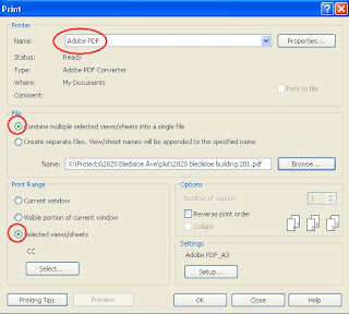
  1. Select PDF as your printer.
  2. Use "Settings" to setup the correct page size and scale.
  3. Under "print range" select "selected views / sheets", then select the views/ sheets you want to print. I am assuming you wish to print more than one drawing sheet!
  4. Under "file" select "combine multiple selected views / sheets into a single file"
  5. select the big "OK" to print
  6. You will then be prompted for a file name and file location. Set this to suit you, and away you go... multi-page PDF.


Thanks to the Revit team for setting this up!


Tuesday, October 31, 2006

TAG by Material

When preparing elevations, I spend a lot of time writing the same descriptive notes for walls, windows, handrails, roofing, gutters etc etc.....

Often I will write all the notes I want on one elevation, and then copy and paste into the other elevations, and move around the arrows. That works fine, but what if some of the materials or descriptions change? I must admit, I also find this part of the job fairly dull and routine. What if I could also standardise this for my projects, so the notes were already written and ready to use?


I accidently discovered a different method.

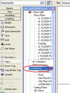
In Revit, I know about Tags. I can tag doors, windows, and walls. That Tagging by CATEGORY. I also noticed there is a TAG by MATERIAL.

What is that?

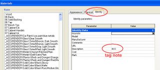
The TAG by MATERIAL reads the "description" line in the material definition. The "description" is located on the IDENTITY tag under the Material Definition dialogue.


This means that the tag is reading the description on the material you are tagging. For example you may have a "weatherboard cladding" or "face brickwork". Perhaps "powdercoated alum framed window" or "painted timber post" or "colourbond metal roof sheeting".

All these notes can be "pre-built" into the material definition you assign to your walls, roofs, windows etc. Then just TAG with MATERIAL to get your notes on the drawings. For me, it's a bit more fun than the old way, and I can predefine my notes in my template file by setting up my material definitions.

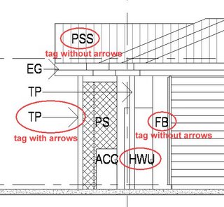
It's possible to TAG with aleader and arrow, or to TAG without a leader and arrow.


For this current project, we use codes on the drawings that are then referenced to a legend. This is a perfect use of TAG by MATERIAL. For long descriptions that would be word wrapped, the TAG by MATERIAL will not work, as it is just a one-liner.

Happy Tagging!